

UX/UI designer…….Hanna Stadnyk
Project…………………Case study
Year…………………….2021
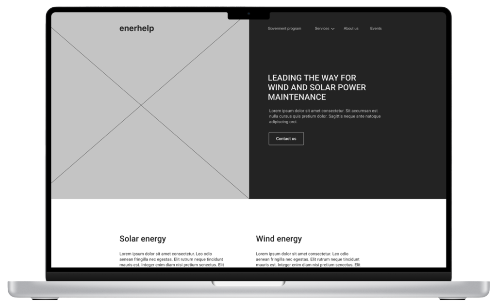
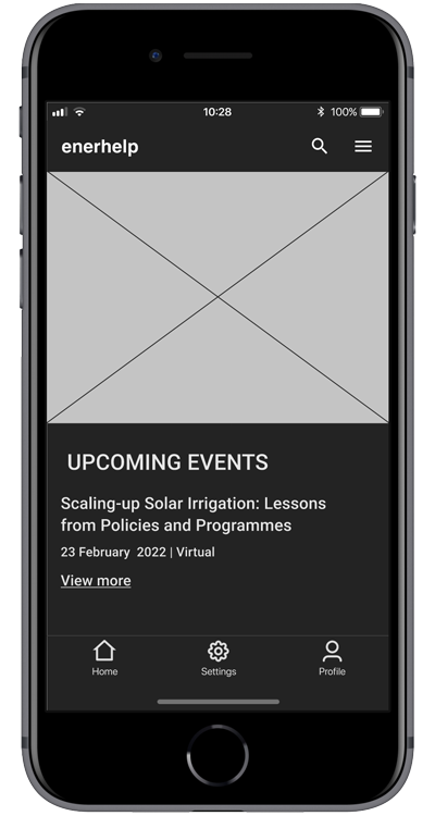
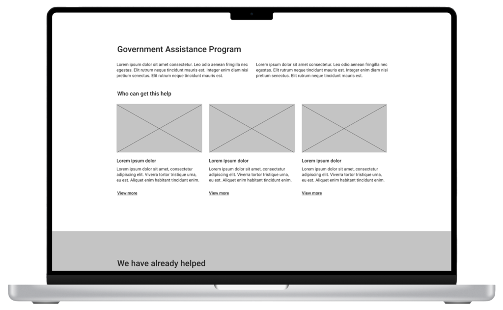
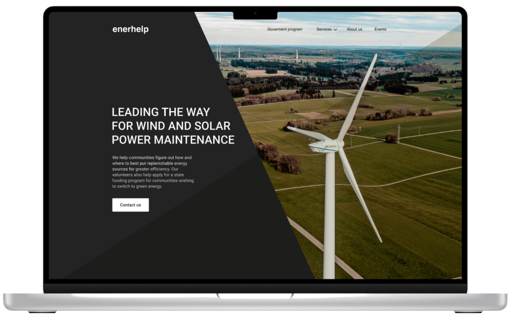
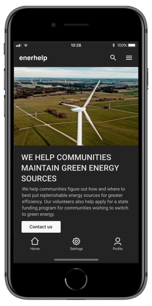
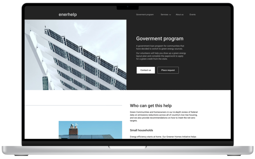
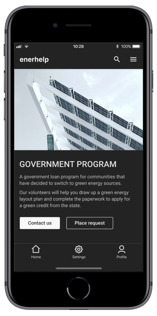
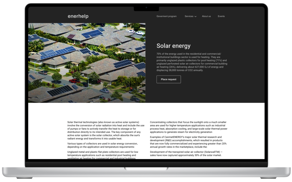
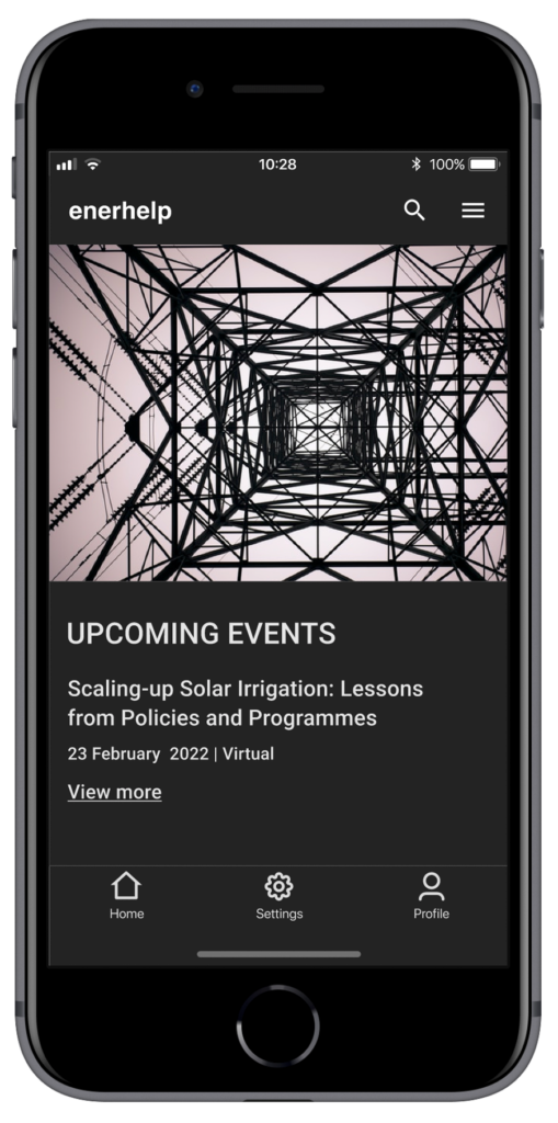
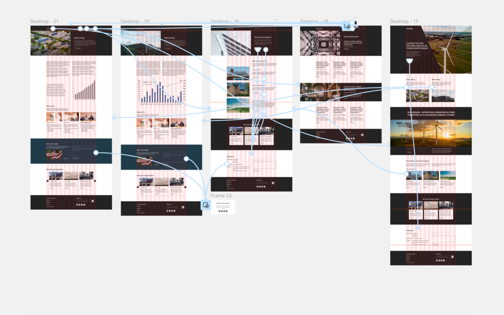
As part of Google’s UX design course, an app and responsive website were created for a nonprofit organization that helps communities transition to green energy.
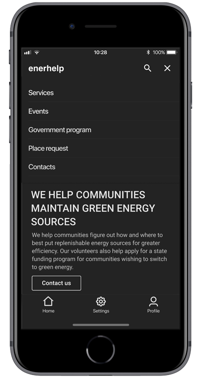
Objective: To create an application for cell phones.
So I created a design of an application for a nonprofit organization that helps communities transition to green energy.
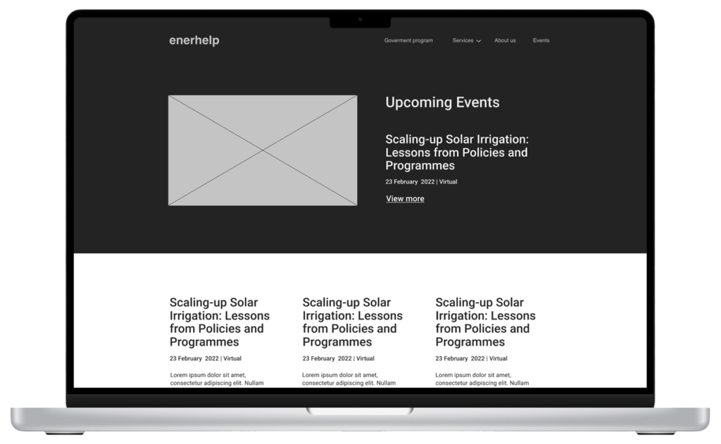
A website and app design for a nonprofit organization that helps communities and homeowners with the transition to green energy.
Conducting competitive audit, interviews, paper and digital wireframing, low and high-fidelity prototyping, conducting usability studies, accounting for accessibility, and iterating on designs.
To fix the problems caused by climate change, it is very important that all countries and communities make the transition to green energy as soon as possible. Even if you or your community are ready to start that transition, you need to find a company or organisation that can help you make this transition.
Help communities and homeowners find organizations that can help make this transition quick and smooth.
Learn how to design a holistic and consistent cross-platform user experience.
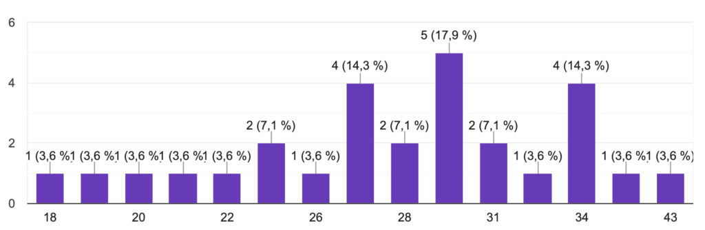
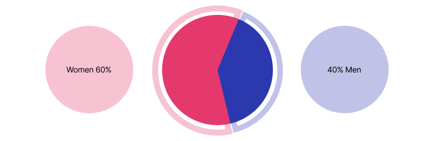
In order to better understand the target audience, I conducted a survey with 10 respondents.
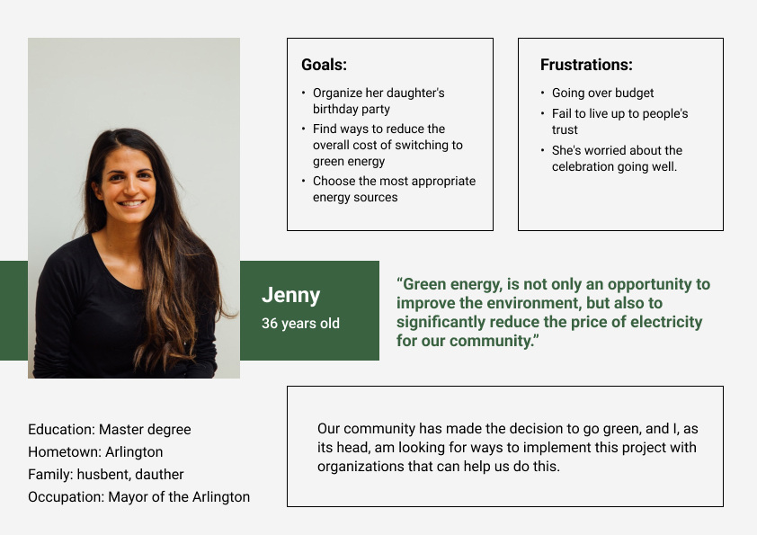
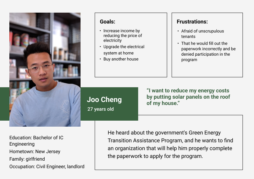
I conducted interviews and created empathy maps to understand the users I’m designing for and their needs. A primary user group identified through research was community heads, landlords, and homeowners looking to transition to green energy sources.
Wrong decision (Choose the wrong green energy source and as a result, get a lack of energy efficiency.)
Money (Community leaders fear miscalculating the budget and going over budget, thereby failing their community members.)
Filling out paperwork incorrectly (Respondents are concerned that improperly completed paperwork could be a reason to deny participation in the state’s green energy transition assistance funding program.)
Problem statement: Jenny is the Mayor of Arlington, who needs to find a way to help her city transition towards green energy because her community has made a decision to go green.
Problem statement: Joo Cheng is a landlord who needs help with applying for a government program because he wants to reduce his energy costs by switching to green energy.
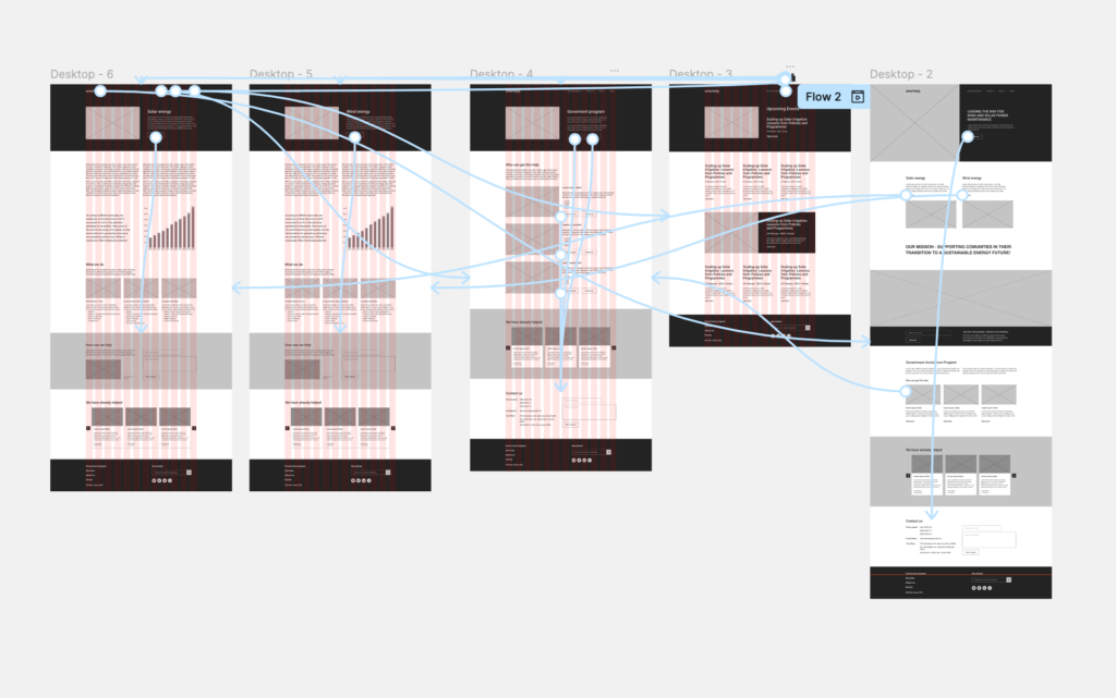
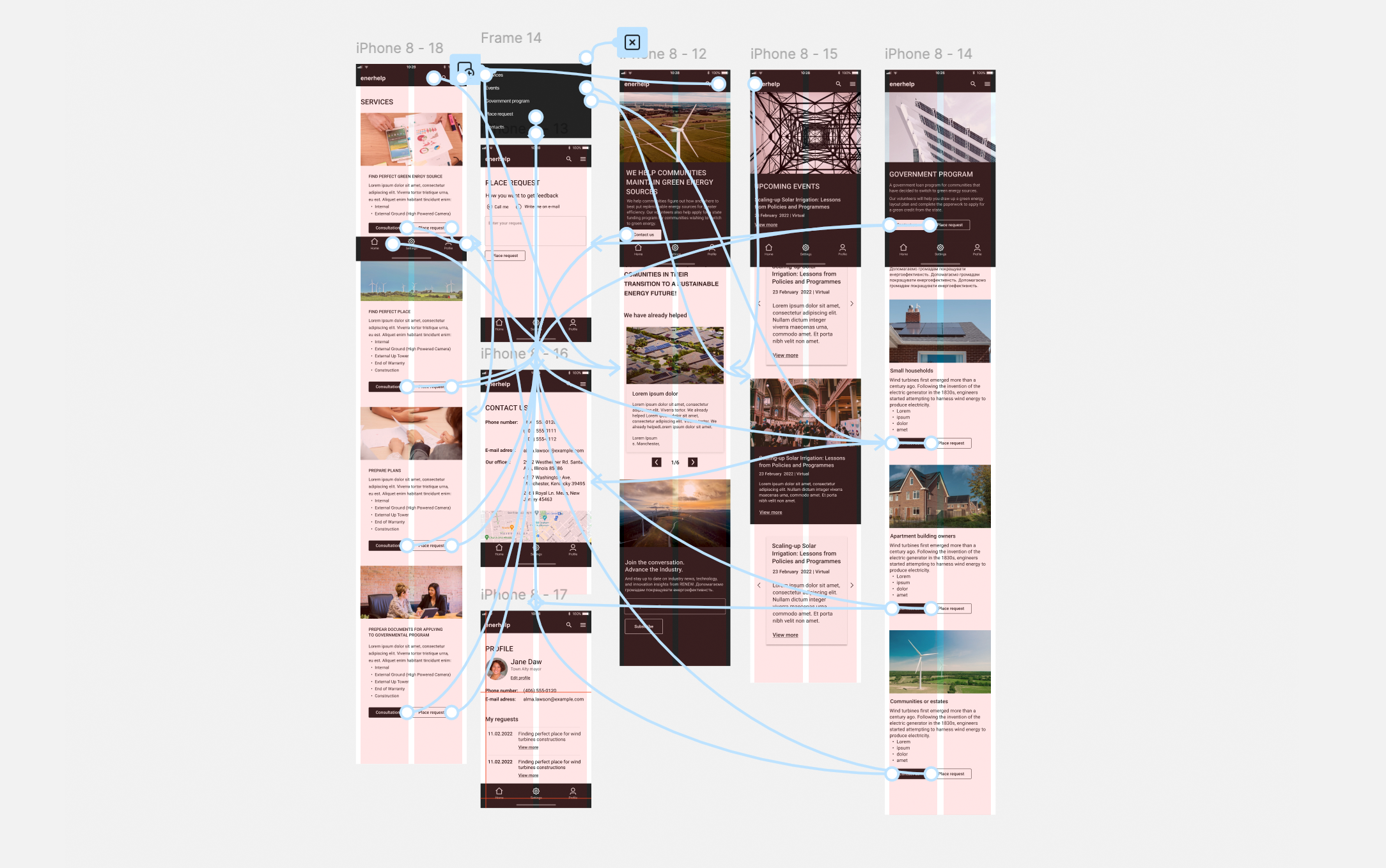
As the initial design phase continued. I made sure to base screen designs on feedback and findings from the user research, and I tried to create a consistent user experience across all devices and platforms.
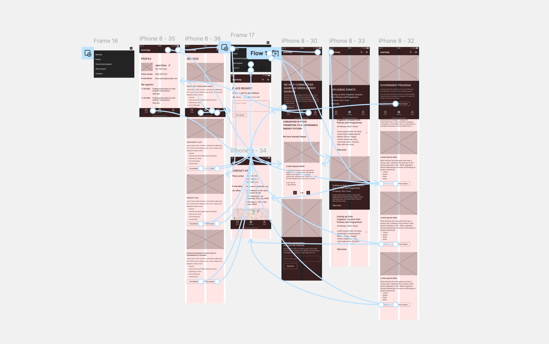
The low-fidelity prototype connected the primary user flow, so the prototype could be used in a usability study with users.
3 participants between the ages of 26 and 55 who are homeowners or community members who want to go green.
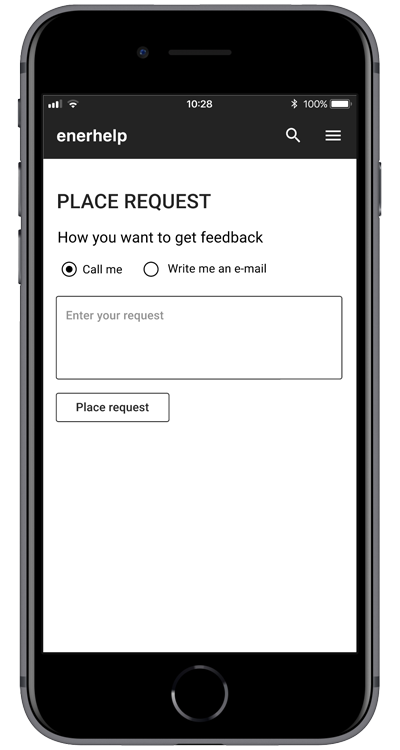
5-10 minutes USA, remote unmoderated usability study. Users were asked for a place request on a low-fidelity prototype.
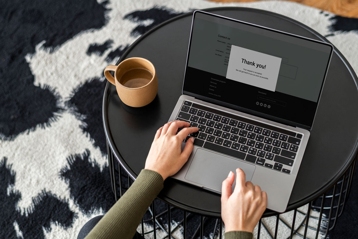
Users need to have an on-screen confirmation of the request.
Colleagues drew my attention to the fact that it is not convenient for the users to see two equal buttons in front of them, as it is confusing. Therefore, on the screen, there are a primary and a secondary button.
The final high-fidelity prototype presented cleaner user flows for food ordering and table reservation. It also met user needs for a pickup or delivery option, as well as more customization.
Provided access to users who are vision-impaired by adding alt text to images for screen readers.
The use of safe colors and contrasts in accordance with the rules of accessibility.
The app and website help our users find and get the advice and help they need in the transition to green energy. Gives the feeling that our company really thinks about how to meet their needs and tries to become more and more useful and provide better services to the customers.
I’ve learned to create app and website designs that together convey the same message, are consistent, and are great for viewing on a device.
Conduct more user research to determine any new areas of need.