

UI/UX case study………Hanna Stadnyk
Language…………………Ukrainian, Russian
Year…………………………2019
As a graduation project on the design course, we were given the task of redesigning the websites of well-known companies in our country. We had to determine the target audience, conduct surveys, identify problematic points of contact with users, based on the information obtained, and develop a convenient adaptive design of the website or online store.
The company I had to work with was Brocard, one of the biggest cosmetics and perfumery stores in Ukraine.
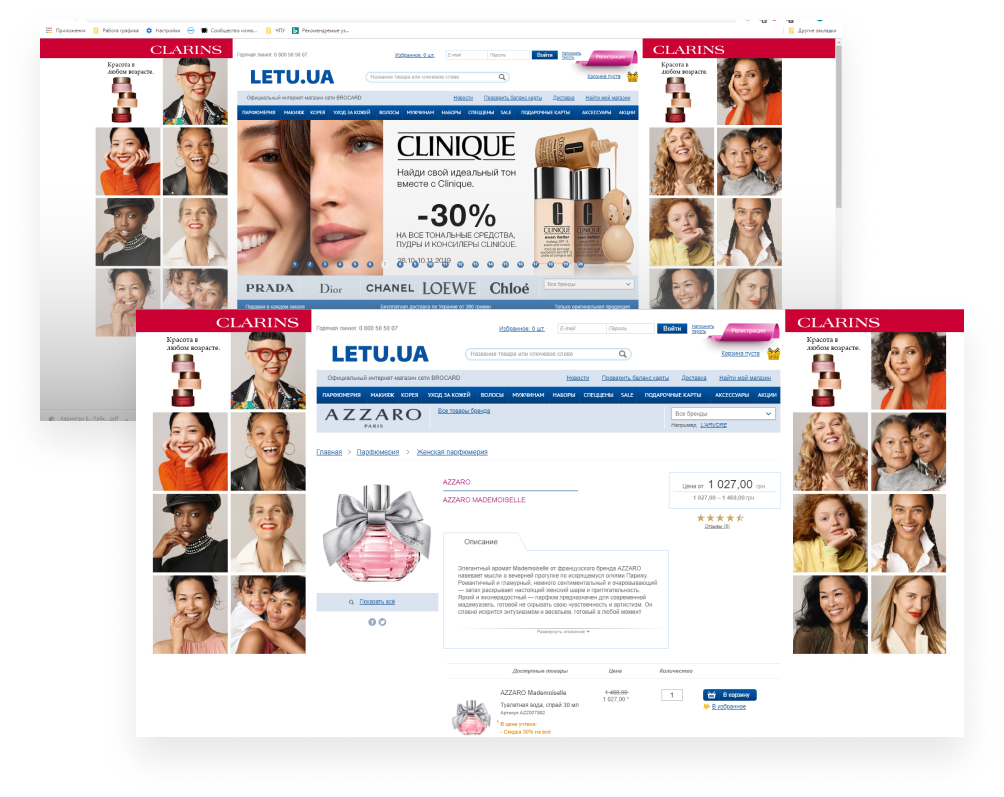
The audience survey revealed the following problems: sophisticated search and confusing site architecture, lack of filters, outdated design, and too much advertising.
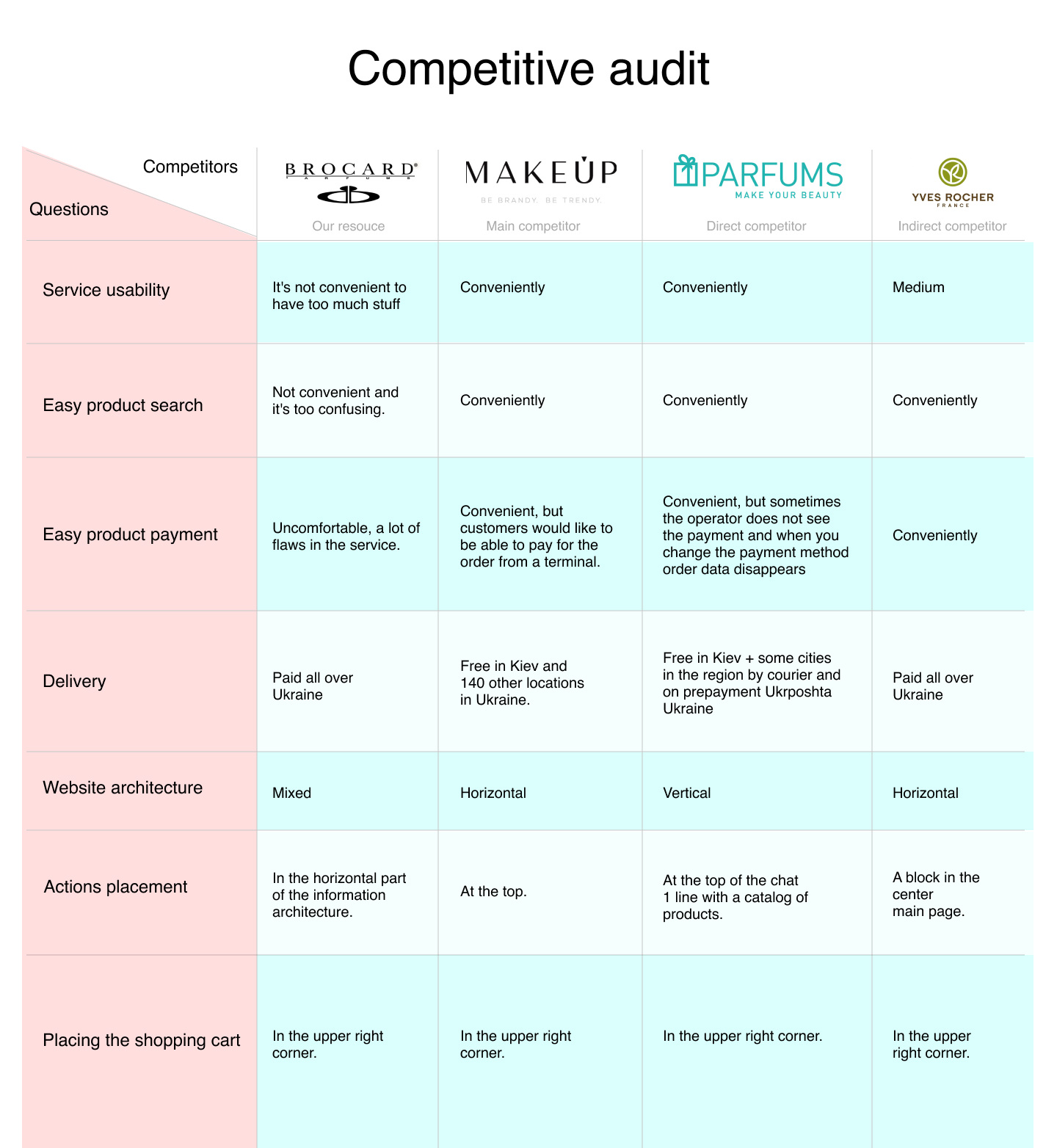
Based on a survey of the target audience and a comparative analysis of competitors, the interface pain points and main problems that needed to be fixed were identified.
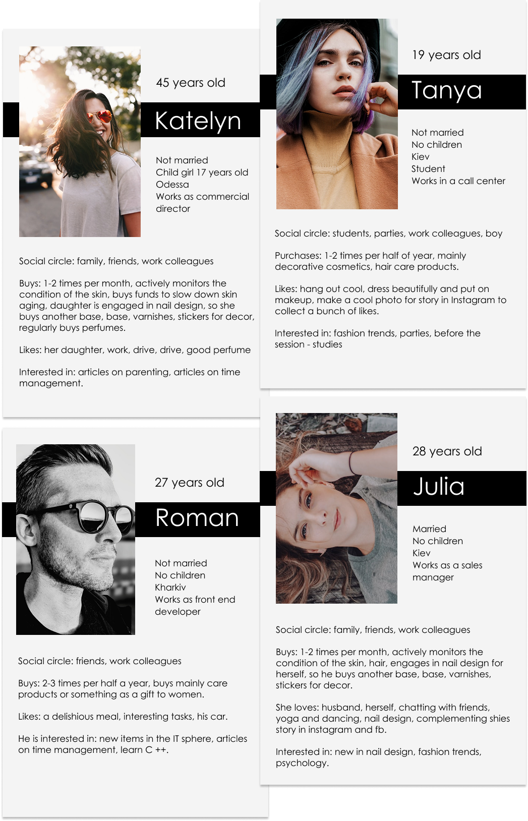
Based on surveys of the target audience, I compiled 4 personas (archetypes).
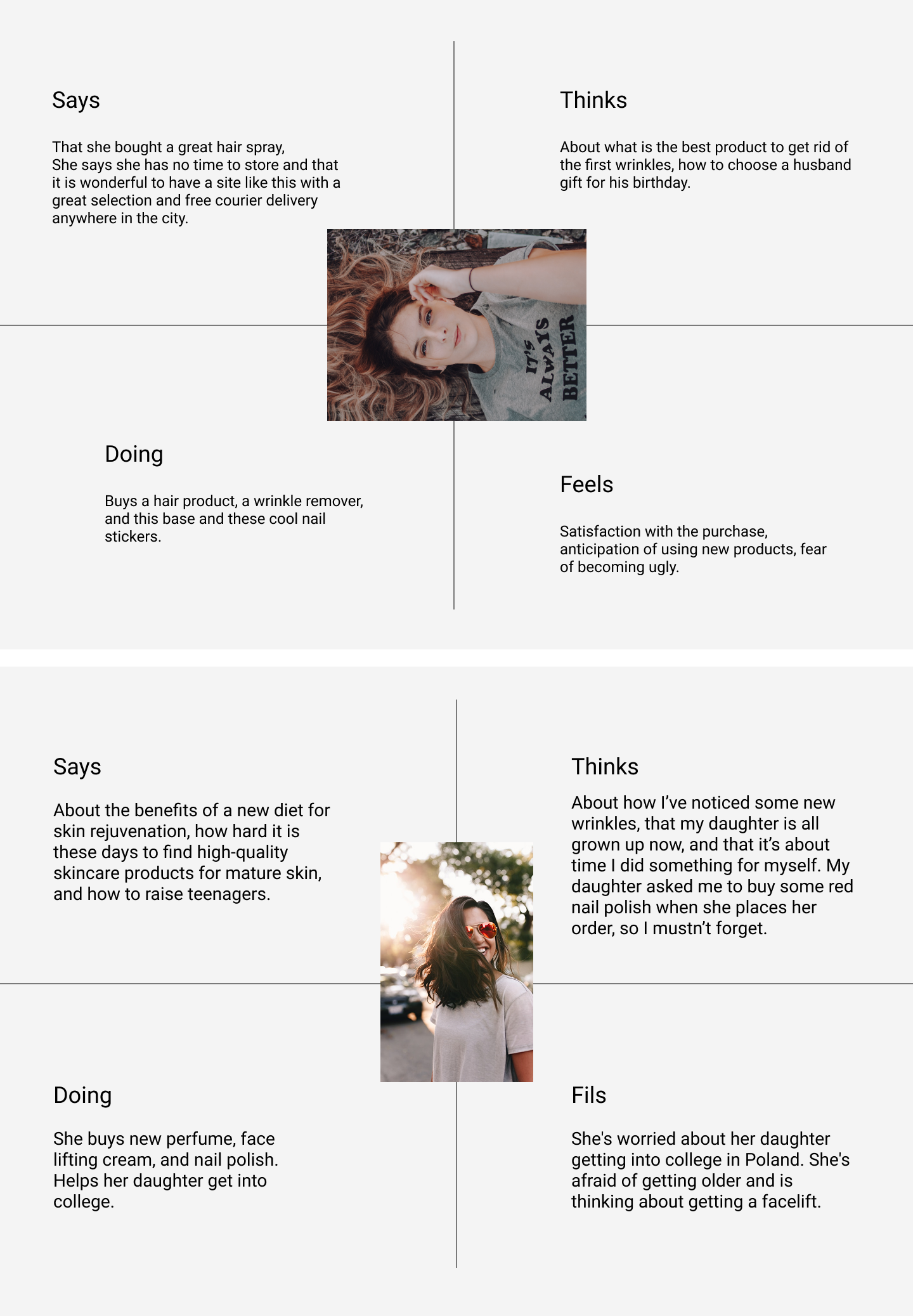
Empathy maps were created to help improve the user experience by better understanding users’ needs.
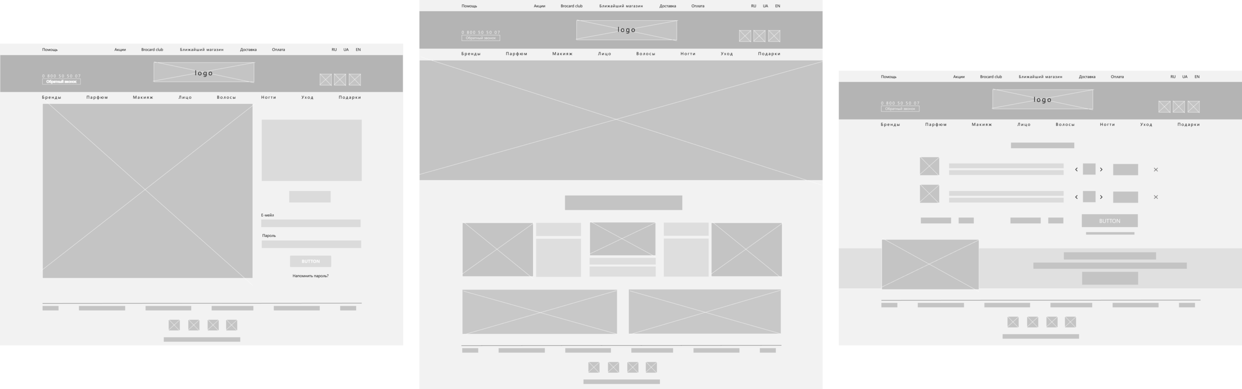
In the creation of wireframes, the first step was to simplify the work with the site and the structuring of information. Almost all the participants in the target audience surveys spoke of the excessive complexity and confusion of the previous version of the site.
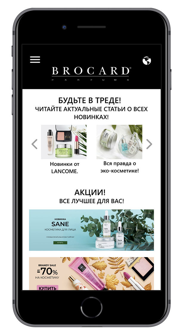
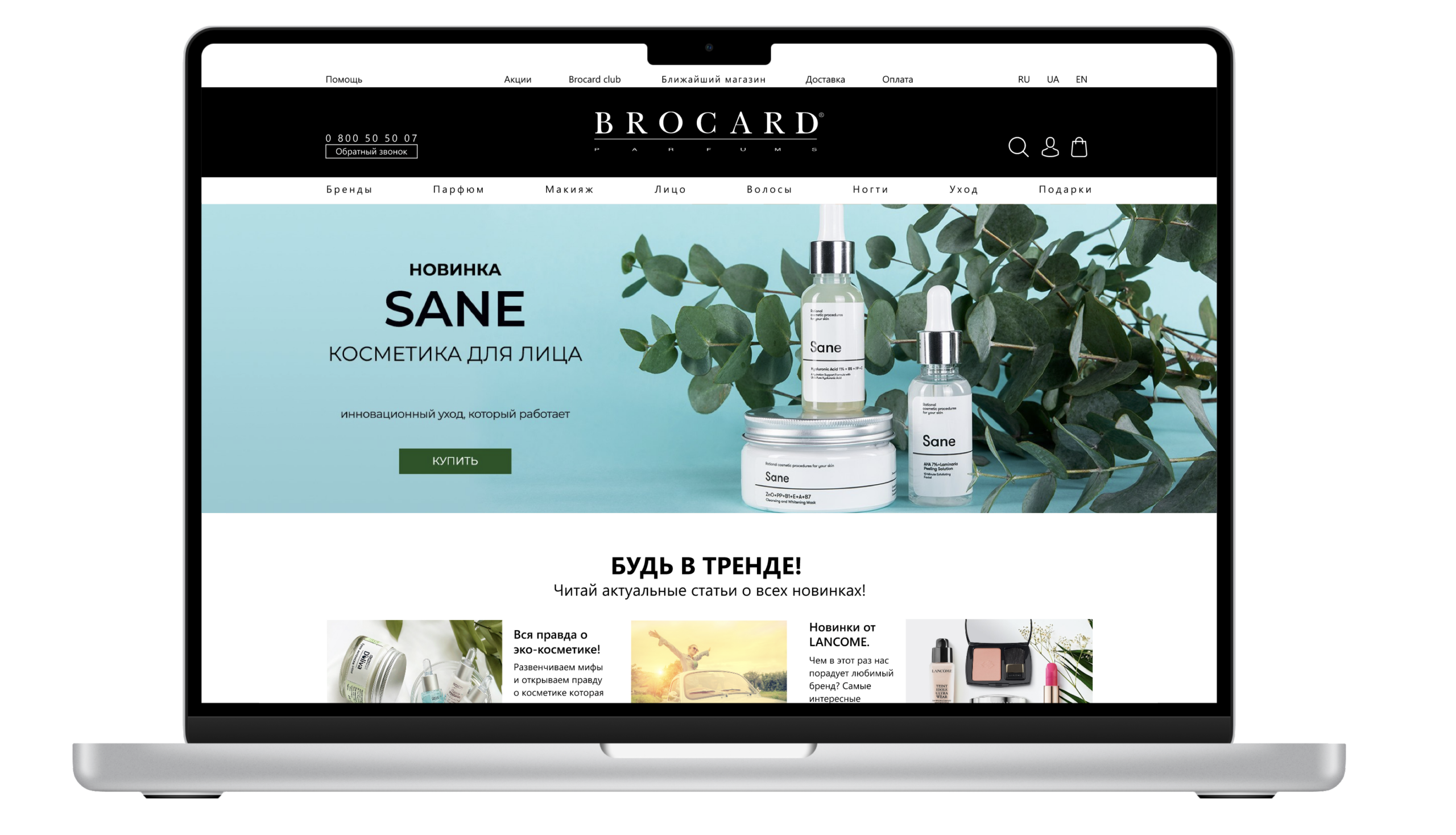
The main page was designed to be straightforward and unobtrusive, while also providing valuable content to capture the user’s attention.
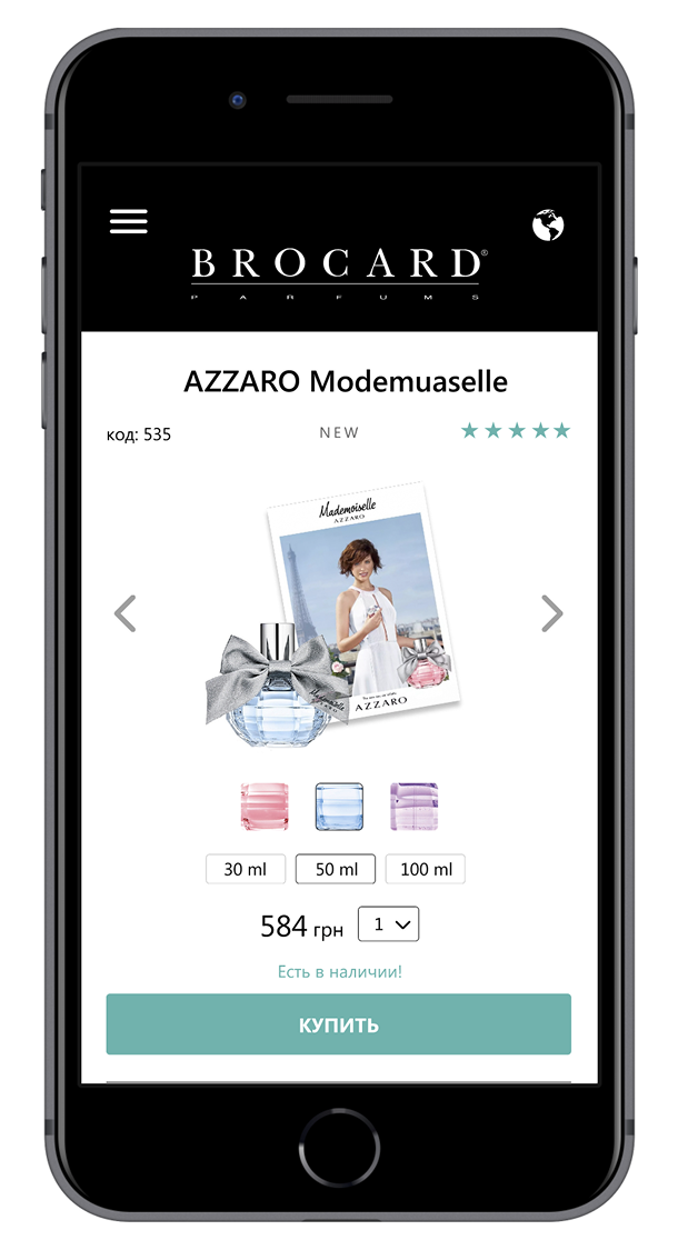
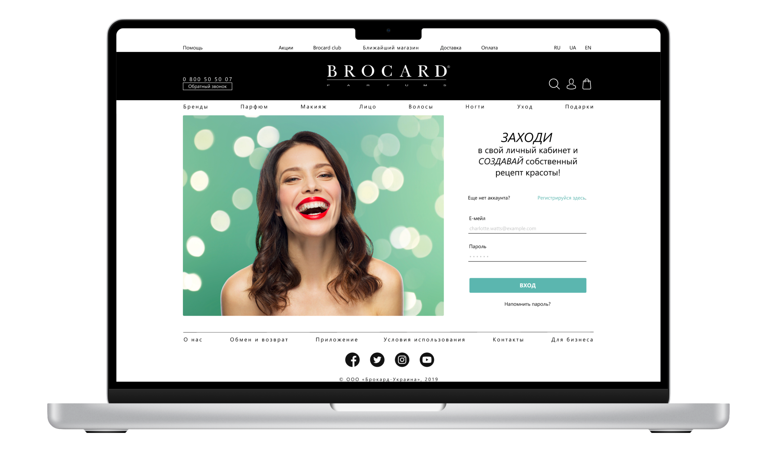
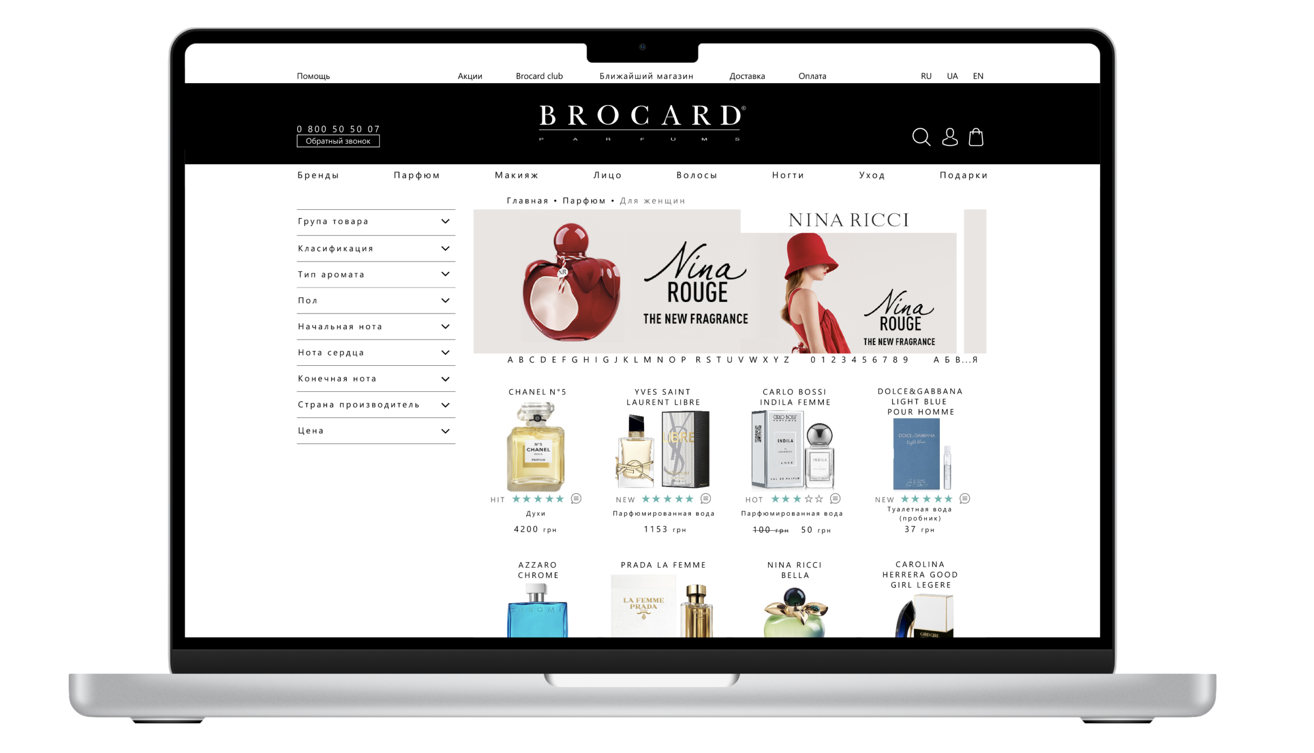
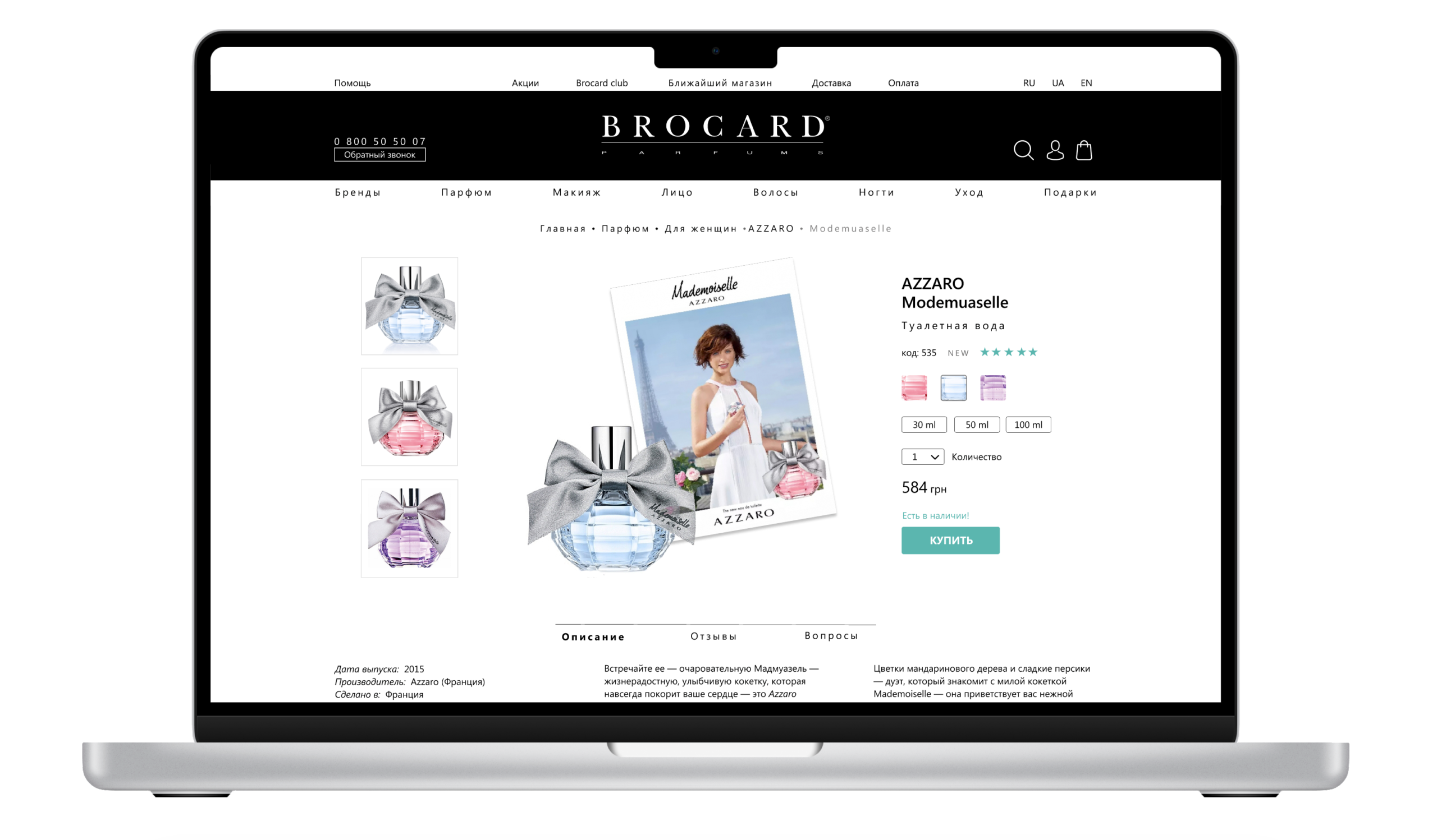
The registration and entry page in your personal account should be straightforward and instill a sense of confidence. We offer the most convenient filters and informative product cards. It includes a comprehensive product description, customer reviews, reviews from bloggers, and a selection of similar products, enabling you to provide the customer with the best possible guidance in making a purchase.
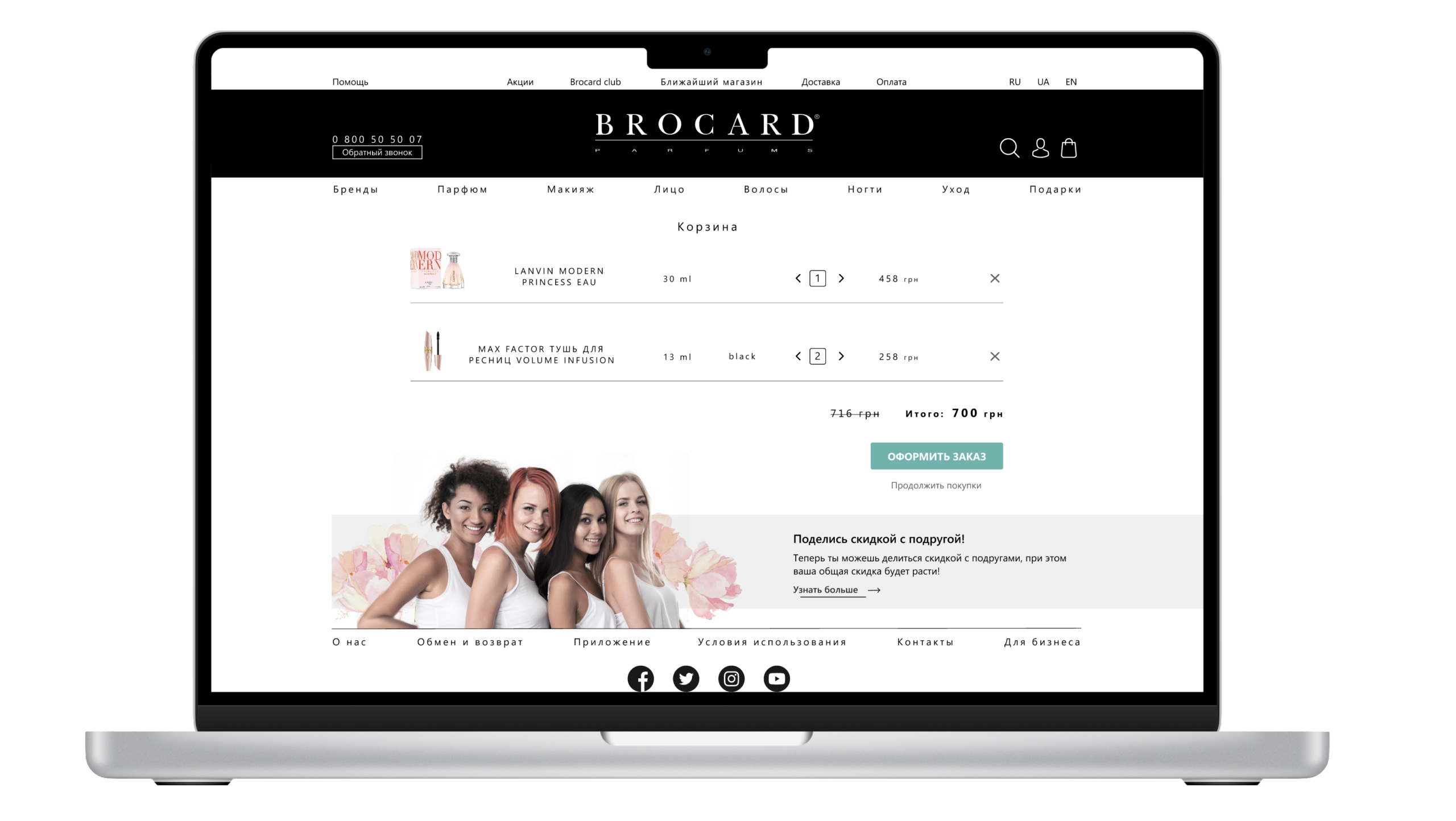
The basket feature enables customers to efficiently place orders or continue browsing while remaining informed about current promotions.
Overall, the redesign of the website has resulted in a user-friendly shop with a stylish design, easy filters, and intuitive placement of sections. It has been met with positive feedback, as it meets the needs of both businesses and users. This resolution effectively addressed the primary issues that had been identified.